Change complex data into clear, actionable visuals for smarter decisions. Find the perfect data visualization company to work with.


Are you tired of data that confuses instead of clarifies? Well, data visualization can help avoid this with charts and dashboards that update in real-time.
This makes it easier for management to spot bottlenecks, notice underutilized resources, and plan ahead for smoother deployments, project timelines, and even logistics.
So, we’ve summed up the top data visualization companies that transform complex data sets into accessible and understandable visual representations to add some insight.
Data visualization is the process of representing information graphically. This involves gathering, cleaning, and analyzing data, then presenting it through charts, graphs, and dashboards to facilitate informed business decisions.
Effective data visualization tools, such as Power BI, Tableau, Amazon QuickSight, and Cognos, allow for real-time updates and interactive exploration.
SumatoSoft is a data visualization company that also provides software development and data analytics services. They offer solutions for various industries, focusing on converting data into visual formats for better understanding.

Founded by Andrew Pavliv (N-iX CEO), Dmytro Kosarev, and Werner Richard Kreiner back in 2002, N-iX is a software development and data visualization company with expertise in data engineering and visualization. They create custom visualization solutions to help businesses analyze and interpret data effectively.

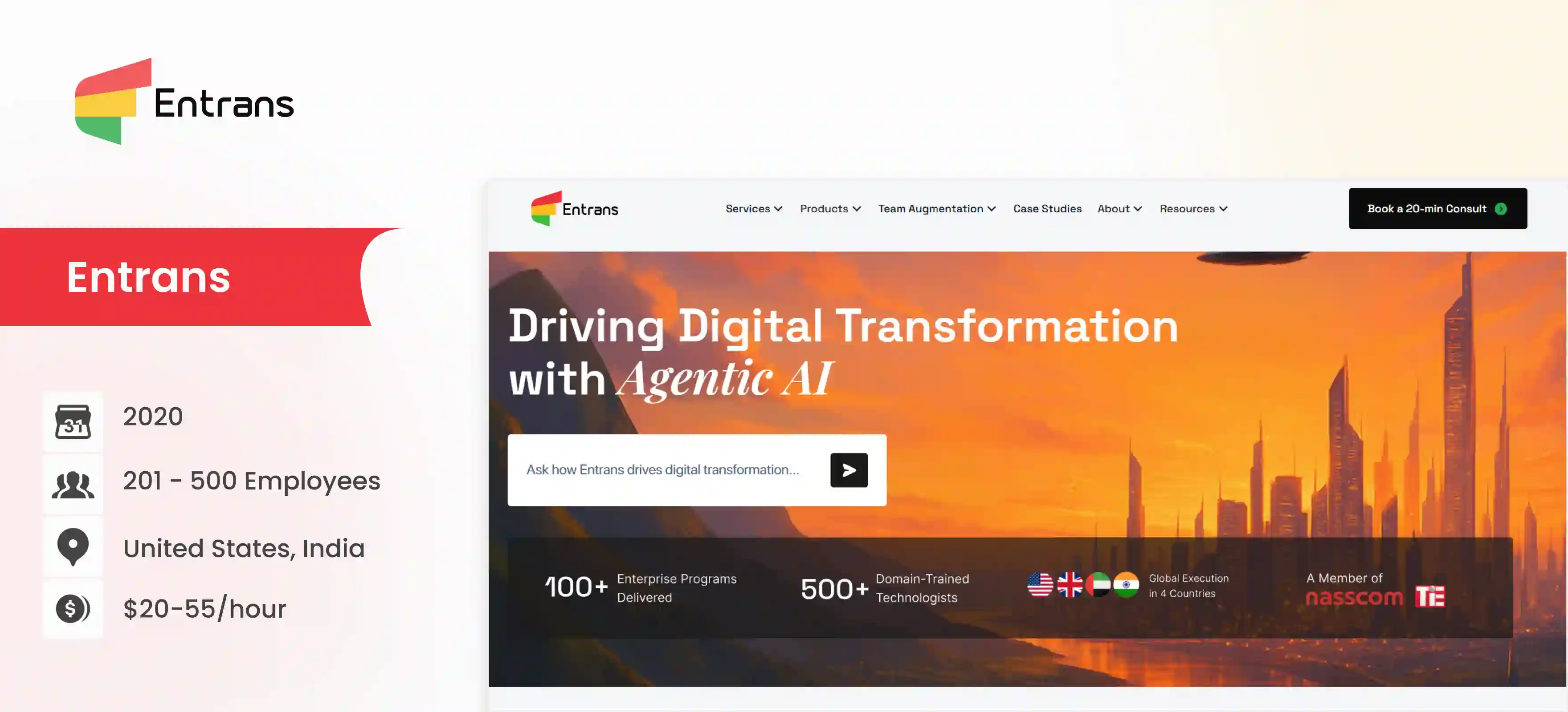
Entrans is one of the top data visualization companies for data visualization services, product engineering and cloud engineering. They work with various technologies, including Power BI, Tableau, and Amazon QuickSight, to create interactive dashboards.
Entrans works with Fortune 500 companies and smaller enterprises to create solutions with CI/CD frameworks and well-optimized data pipelines. With a huge range of developers with experience with different cloud ecosystems and data visualization platforms, we can help automate visualization framework and metrics avoiding all data silos!
Entrans helps businesses transform raw data into compelling visual stories, enabling them to identify key trends and make data-driven decisions. Their expertise in data visualization supports improved business intelligence and strategic planning.
A multi-billion-dollar manufacturing giant was being held back by a slow and overpriced Tableau system.
They turned to Entrans for a high-stakes migration to Microsoft Power BI, needing to transition years of critical data with absolutely zero disruption to their global operations.
We engineered a flawless transition, going beyond a simple data transfer or data visualization services to completely re-architect their analytics for future growth.
The results, delivered in under six months, were transformative:
ScienceSoft is one of the top data visualization companies in terms of software development for the last three decades. Their services include data visualization and app development as part of their service offerings. ScienceSoft USA Corporation has been listed in the Global Outsourcing 100 by IAOP and the FT's 500 fastest-growing Americas’ companies.
They provide solutions for data analysis and visualization to support business intelligence in manufacturing, transportation and logistics, retail, telecoms, oil and gas, and professional services.

InData Labs focuses on data visualization solutions. This data visualization company helps companies transform raw data into visual insights to drive decision-making.
They work with aspects like big data analytics, data infrastructure engineering, and even data visualization.

Intellectsoft is a top data visualization company that handles software development, data engineering, and data visualization services. They focus on creating visual representations of data to facilitate better business insights and decision-making.
This data visualization company also deals with big data and analytics, product design and engineering, IT strategy consulting, testing and QA, DevOps, IT infrastructure management, and custom app development.

Edvantis provides software development services, including data visualization. This data visualization company helps businesses use data to identify trends, patterns, and anomalies.

Alpha Apex Group is a consulting firm that includes data visualization among its services.
Alpha Apex is one of the data visualization companies that aims at helping organizations leverage data visualization to achieve their strategic goals with effective and compelling insights.

ThirdEye Data specializes in data and cloud analytics, offering data visualization solutions to help businesses gain insights from their data.

Yalantis is a software development company that provides data visualization services as part of its offerings.

The field of data visualization is continuously evolving. Key trends shaping the future include:
Many companies struggle to transform complex data into clear, actionable visualizations that drive effective decision-making.
Entrans is a data visualization company that specializes in solving this challenge, helping Fortune 500 organizations unlock valuable insights and implement data-driven strategies through impactful visual representations.
We help with complete data solutions – from engineering to visualization – across AWS, Azure, and Google Cloud, with certified experts in AI and diverse tech stacks.
Our proficiency in Python, SQL, Power BI, Tableau, and 40+ data ecosystems ensures your business gains actionable, real-time insights.
Book a free consultation call to know how our data visualization services can change your data pipeline!
The four pillars of visualization are Purpose, Content, Structure, and Formatting. First, you must define the goal or the 'why' behind the visual (Purpose) and what data will be shown (Content). Then, you choose how to organize it with the right chart type (Structure) and apply colors, fonts, and labels to make it clear and attractive (Formatting).
The three main types are exploratory, explanatory, and dashboards. Exploratory visualization helps analysts find patterns and insights within data for themselves. Explanatory visualization is used to tell a specific story or finding to an audience, while dashboards provide a live, interactive view of key metrics and data points.
Choosing the most suitable overseas data visualization company depends on your budget and the scope of your work. That said companies like Entrans go out of their way to meet project deadlines. Other companies worth considering include Accenture and N-ix.
Data analytics is the broad process of cleaning, transforming, and modeling data to discover useful information and support decision-making. Data visualization is a specific tool within analytics that focuses on representing this information graphically through charts and maps.
In short, visualization presents the findings that analytics uncovers.
Yes, overseas data visualization companies can be very reliable, as dependability is based on the company's reputation, not its location. To ensure a good partnership, you should check their portfolio, client reviews, and communication processes. Many businesses worldwide successfully outsource this work to firms in countries like India to access specialized talent and achieve cost efficiencies
Data visualization companies rely on powerful platforms like Microsoft Power BI, Tableau, and Looker Studio. These tools are essential for connecting to diverse data sources and creating interactive dashboards for clients. For highly customized projects, developers also use programming libraries like D3.js and Python's Matplotlib to build unique visuals.
Yes, Excel is a fundamental and widely used data visualization tool for creating basic charts like bar graphs, line charts, and pie charts. It is perfect for quick analysis and simple reporting directly within a spreadsheet environment. However, for handling large datasets and building complex, interactive dashboards, more specialized tools are typically required.
The process begins with acquiring the raw data and then cleaning it to ensure it is accurate and properly formatted. Next, you determine the story you want to tell and choose the most effective chart or graph type to represent that message. Finally, you use a tool to build the visualization and then refine its design to make the insights easy for the audience to understand.