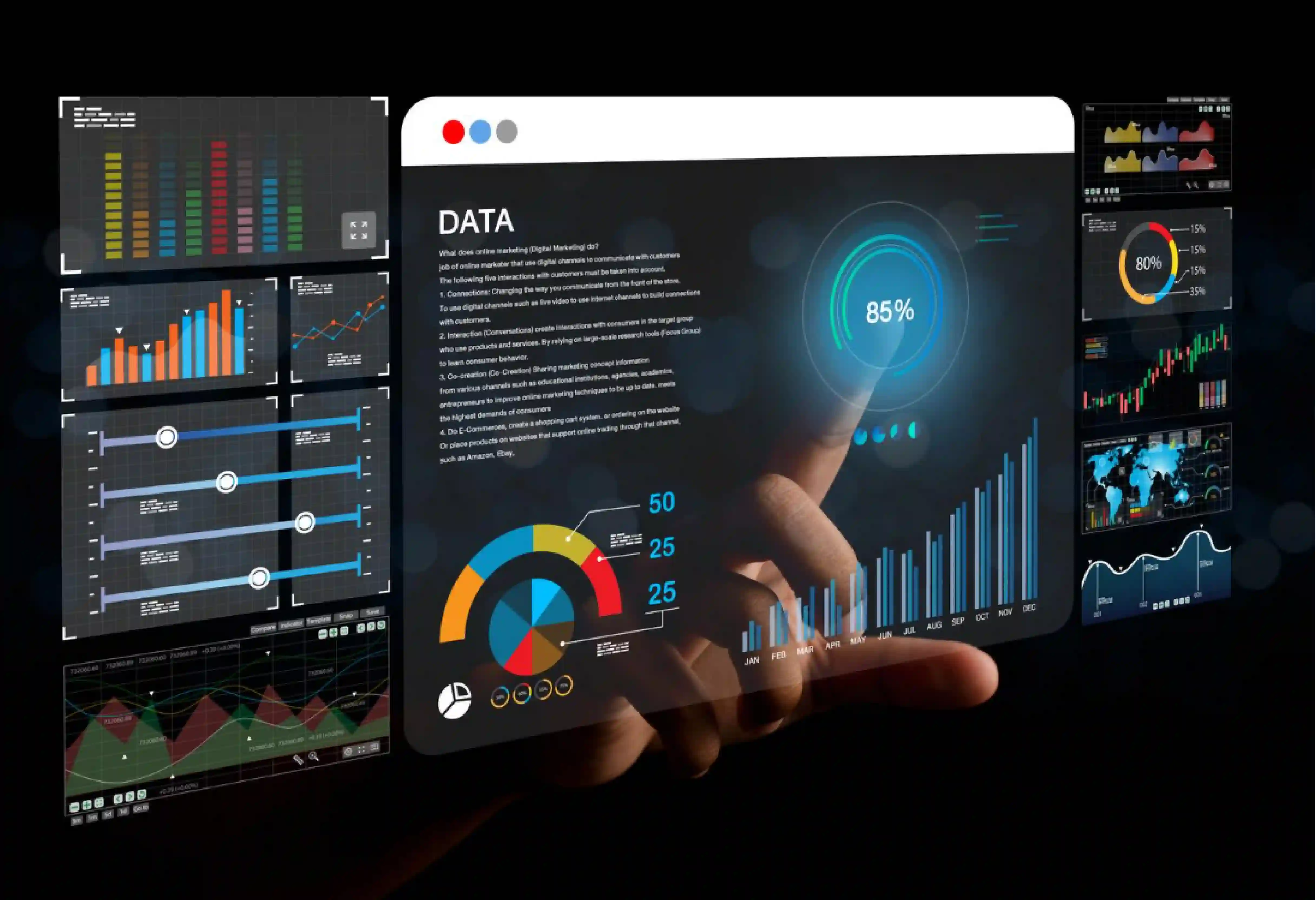
The challenge: Too much data, not enough insight
CIOs today are surrounded by metrics—project dashboards, cloud spend reports, ticket volumes, uptime scores—but very few of these convert into actionable, board-level narratives.
When quarterly reviews arrive, technology leaders spend days assembling slides to explain what these numbers actually mean for the business:
- How does IT investment translate to business outcomes?
- Which programs create the most value?
- Where are costs growing without visible ROI?
The problem isn’t a lack of data; it’s a lack of synthesis.
From metrics to meaning
The CIO Dashboard by Entrans converts dispersed operational data into a single, executive-ready view. It integrates inputs from cloud, DevOps, security, and finance systems to produce visual insights that link technology performance to business value.
Built for the boardroom:
- Aligns IT KPIs with strategic themes—growth, efficiency, risk, and innovation.
- Translates technical metrics into financial impact and productivity outcomes.
- Presents a consistent narrative across teams and reporting cycles.
Key capabilities
1. Unified visibility
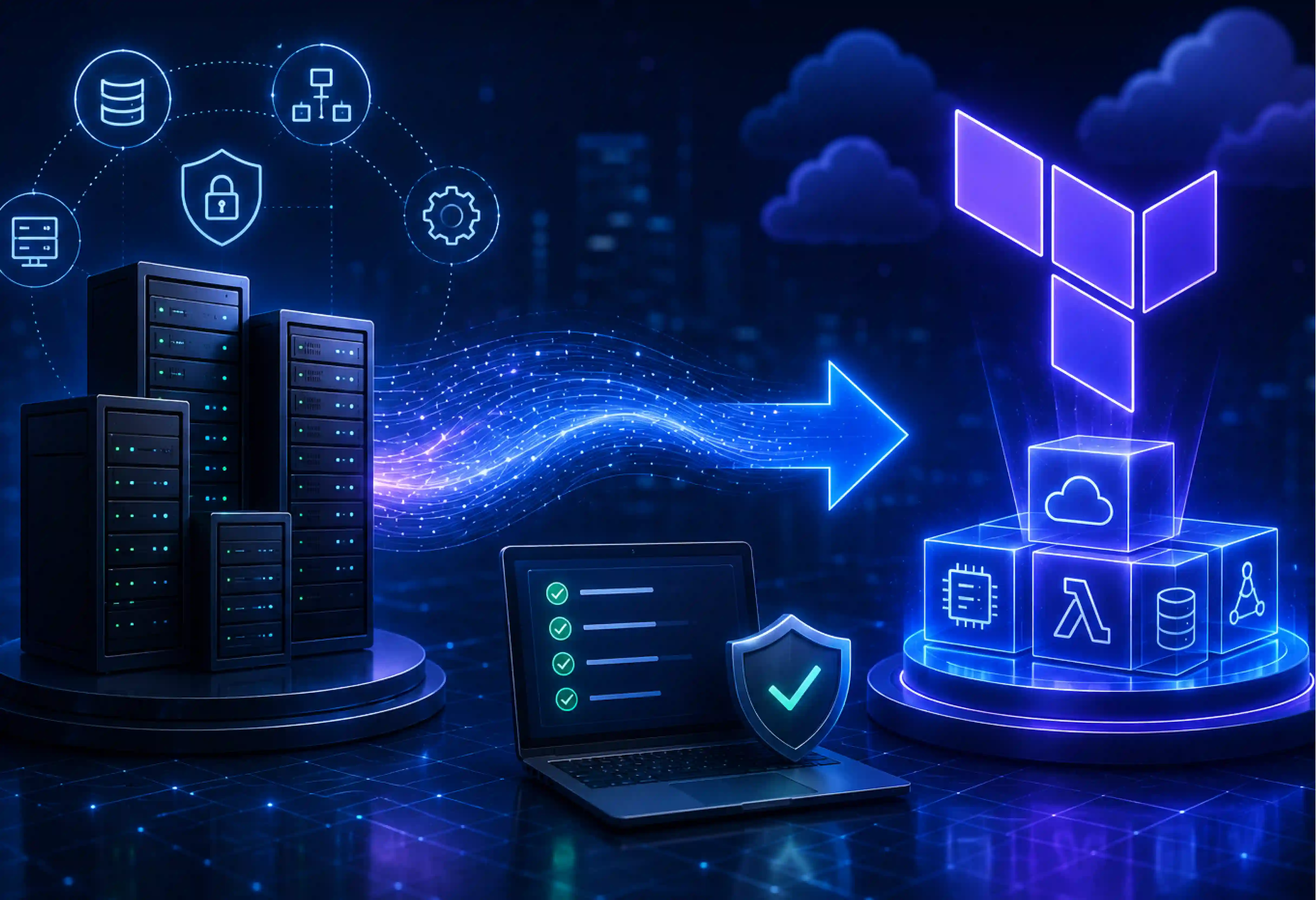
Connects to existing tools (Jira, ServiceNow, AWS, Azure, Google Cloud, SAP) to deliver a consolidated view of:
- Infrastructure uptime and SLA adherence
- Cloud consumption and FinOps metrics
- Delivery velocity (release frequency, MTTR, deployment lead time)
- Automation coverage and AI adoption progress
2. Outcome-based analytics
Each metric is expressed in terms of value: cost avoided, revenue enabled, or risk reduced. This allows CIOs to answer questions such as:
- How much business downtime was prevented this quarter?
- What was the ROI on our automation initiatives?
- How did our AI investments improve employee productivity?
3. Storytelling made simple
Drag-and-drop visual templates turn IT data into board-ready presentations. CIOs can customize dashboards by strategic pillar—operational efficiency, security posture, sustainability, or digital innovation—and export visual summaries directly into executive decks.
4. Predictive and prescriptive intelligence
Machine-learning models surface early indicators of budget overruns, performance degradation, or delivery bottlenecks. Predictive views help CIOs pre-empt issues before they appear in board discussions.
5. Compliance and ESG reporting
Pre-built modules link IT metrics to ESG and governance disclosures. CIOs can showcase energy efficiency, cloud sustainability, and compliance posture as part of the enterprise ESG story.
Architecture overview
The dashboard follows a three-layer design:
- Data Integration Layer
Connectors aggregate data from operational and financial systems into a centralized analytics repository. APIs ensure real-time sync without duplicating datasets.
- Insight Engine Layer
AI-powered analytics correlate IT performance with business KPIs, applying contextual tags such as cost impact, automation ROI, or SLA variance.
- Visualization Layer
Dynamic dashboards deliver tailored views for different stakeholders: CIOs, CFOs, or business unit heads. Each view highlights trend analysis, cost efficiency, and risk posture with drill-down capabilities.
Suggested diagram:
A stacked three-layer graphic showing data sources flowing upward through the analytics engine into multiple customizable board-view dashboards.
What success looks like
| Before |
After Entrans CIO Dashboard |
| Fragmented reports from multiple tools |
Unified, real-time dashboard view |
| Manual data consolidation |
Automated data ingestion and analysis |
| Technical metrics disconnected from strategy |
Clear linkage between IT KPIs and business outcomes |
| Reactive discussions on cost and performance |
Predictive insights driving proactive decisions |
| Board decks rebuilt every quarter |
Exportable, auto-generated executive summaries |
Value delivered
- 70% reduction in manual reporting effort
- Real-time visibility into IT investment ROI
- Improved alignment between technology and finance teams
- Greater board confidence through transparent, outcome-driven reporting