> Blog >
Power BI Visual Troubleshooting: Misalignment, Missing Text, and Disappearing Data
Learn how to fix Power BI visual misalignment, missing text, and disappearing data with practical troubleshooting tips for Desktop and Service issues.

Power BI Visual Troubleshooting: Misalignment, Missing Text, and Disappearing Data

4 mins
December 26, 2025
Author
Jegan Selvaraj
TL;DR
  • Root Cause of Drift: Visuals shift because Power BI Desktop and the Service use fundamentally different rendering engines. This architectural gap means coordinates often shift during browser compositing.
  • The Zoom Fix: Distorted layouts and white line gaps usually stem from non-standard browser zoom settings. Reset your view to exactly 100% by pressing Ctrl + 0 to align the sub-pixel rendering.
  • Font Stability: Prevent unpredictable text resizing by manually disabling the "Text Autosize" feature in your card settings. Combine this with web-safe fonts like Segoe UI or Arial to avoid this.
  • Dashboard Logic: Stop pinning individual tiles to dashboards as this often strips your custom conditional formatting.
  • Tired of the new card visual messing up your Power BI report layouts? 

    Well, specific patches can solve that! And also, if you’re unsure why your Desktop designs fall apart in the Service, this guide breaks down the regression issues for you.

    For most BI pros, the problem of reliably displaying headline metrics like Total Revenue or NPS can be solved with proper troubleshooting.

    So, to help you get started, we’ve listed the fixes worth looking into.

    Open Popup
    Table of Contents

      Common Causes for Power BI Visualization Issues: Why Visuals Move, Cut Off, or Disappear

      I. Rendering and Display Differences

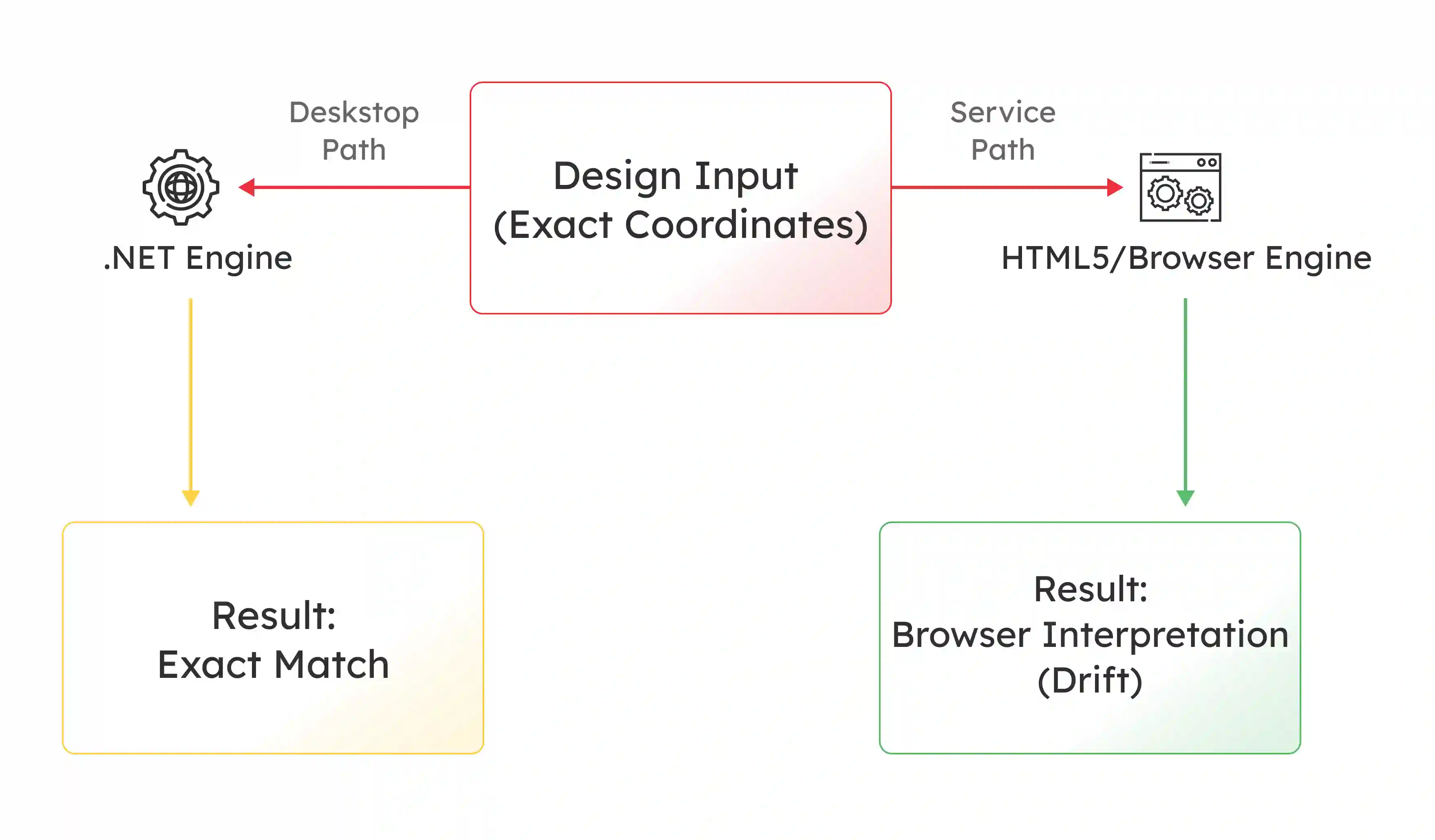
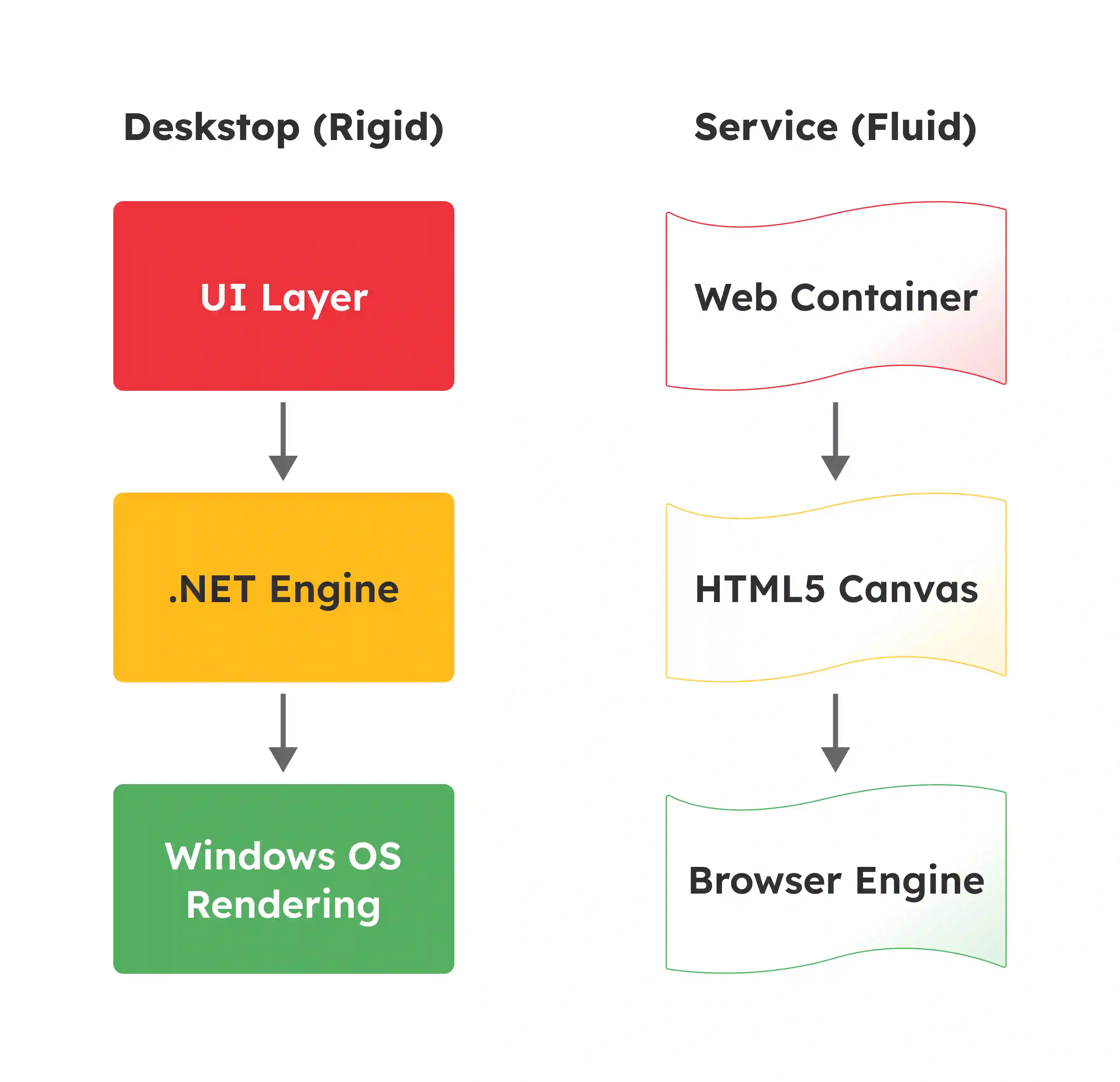
      Trouble mostly stems from the architectural gap between Power BI Desktop and the Power BI Service. Why? Well, these two environments run on fundamentally different rendering engines, which leads to distinct Power BI card visualization issues at times.

      1. Desktop vs. Browser Compositing

      Power BI Desktop relies on a .NET-based rendering engine. This uses Direct2D and Windows OS font rendering, like DirectWrite or ClearType. The Power BI Service renders reports within an HTML5 Canvas or SVG container, which means:

      • This container must put up with the layout engine of the browser.
      • This divergence means that a visual placed at exact coordinates in Desktop may shift around, which happens due to browser-based compositing logic.

      2. Sub-Pixel Rendering Artifacts

      A persistent issue known as the 1-Pixel Border Glitch comes up due to sub-pixel rendering.

      Mathematical calculations for visual positions change when a browser zooms to non-standard levels, such as 110%. 

      Which may result in fractional values like 100.1 pixels, but this issue typically occurs as the browser must figure out how to handle this, and causes Power BI data visualization issues like:

      • The engine to round the value.
      • The engine uses anti-aliasing.
      • Creating a visible white line or gap between visuals.

      3. The Ghost Visual Phenomenon

      A failure in visual registration logic occurred in late 2024. This caused the New Card visual icon to wipe out completely from the visualization pane in Power BI Desktop, but was not a documented deprecation, which leads to Power BI card visualization issues like:

      • The system failed to pick up the Preview GUID and match it with the new GA identity.
      • This left developers unable to set up or modify cards.

      II. Configuration and Formatting Issues

      Specific configuration choices break report layouts beyond rendering engines. With this, things like Schema updates also mess up report layouts.

      That said, understanding these underlying mechanisms helps with Power BI visualization issue troubleshooting.

      1. The Pixel-to-Percentage Schema Shift

      A damaging regression occurred recently. The New Card visual switched over from using absolute pixel or PX values to percentage-based sizing for images.

      The Power BI visualization issue with this is, no migration layer existed for this change, which can mean the engine interpreted legacy integer values like 100 as 100%.

      • Legacy values were meant as 100 pixels, causing icons and logos to blow up massively.
      • This then blocks out data values.

      2. Font Metric Interpretation

      Font rendering is not universal. Why? Well, Windows works out line height based on specific algorithms, which include ascent plus descent plus leading.

      Aside from this, browsers must also use their own text layout engines. Moreover, differences occur even with standard fonts - because of this, Power BI visualization issues can occur, like:

      • A 0.5-pixel difference per row in a matrix can pile up, causing a drift in your data visualization.
      • This can lead to data no longer lining up with static overlays or transparent shapes.

      3. JSON Theme Conflicts

      Failures in data visibility often go back to JSON theme conflicts. A corporate theme might set up a font size for generic visual styles, where the theme might fail to explicitly list it for a specific visual, like the KPI card, due to these Power BI visualization issues may occur like:

      • The Service may apply a default or null value in this case.
      • This has been observed to shrink KPI fonts to microscopic levels, such as 1pt upon publishing.

      Step-by-Step Solutions to Fix Missing or Misaligned Cards in Power BI

      Solution 1: Optimize Browser and System Settings in Power BI  

      Verify the viewing environment is standardized before altering the report design. Misalignment is often a symptom of the conflict between coordinate-based design and fluid web rendering in Power BI. 

      • Reset Browser Zoom: Browser zoom settings other than 100% mess up visual layouts. Verify zoom is set to exactly 100%. Press Ctrl + 0 to reset.
      • Clear Cache and Cookies: Old cached files often bring about display inconsistencies. Corrupted CEF or Chromium Embedded Framework data can cause ghost visuals. Clearing the browser cache is a first line of defense.
      • Adjust System Scaling: High-DPI displays can confuse the UI scaling logic. Go to Settings > System > Display on your Windows machine. Set the scale and layout to 100%. This stops confused rendering on external monitors.
      • Test Multiple Browsers: Rendering engines differ between Chrome, Edge, and Firefox. Test your report across different browsers. This helps rule out browser-specific compositing bugs.

      Solution 2: Configure Fonts and Disable Autosize in Power BI

      Font handling is a major source of drift and truncation. Adopting a defensive design strategy helps keep consistency across platforms.

      • Use Web-Safe Fonts: Custom or downloaded fonts may not be supported in browsers. This leads to fallbacks that break layout. Stick to Segoe UI, Arial, or Calibri. This helps the browser interpret metrics similarly to the Desktop app.
      • Disable Text Autosize: Dynamic text sizing can cause unpredictable resizing in the Power BI Service. Open the Card visual Format pane. Turn off Text Autosize. Manually set a fixed font size.
      • Address the DIN Override: The Service often strips custom fonts when pinning visuals to a dashboard. The system swaps them with the DIN font family. This is a design choice. Narrow fonts like Arial Narrow may overflow due to this switch. They then display ellipses. Pin a Live Page rather than individual visuals to stop this.
      • Hard-Code Fallback Colors: Always state a fallback color in DAX measures used for conditional formatting. Do not rely on default behavior. Explicitly list the else condition, such as Black. This prevents white-on-white text failures if the default visual changes.

      Solution 3: Precision Alignment in Power BI

      Achieving accurate designs calls for abandoning reliance on transparent overlays. Manual positioning in Power BI should be replaced with solid containerization.

      • Snap to Grid: Visuals not snapped to the grid can shift when rendered. Activate View > Snap to grid in Power BI Desktop. Use Align tools to position visuals.
      • Audit Image Sizing: Teams must audit reports created prior to November 2025 due to the pixel-to-percentage regression. Manually update image callouts to use Image Fit: Center. Set the Image Area Size to a manageable percentage, such as 10-15%.
      • Avoid Hybrid Architectures: Stop using transparent shapes or text boxes to create headers for matrices. These hybrid designs are inherently unstable. The matrix rows drift while the static shapes do not. Use the native Title and Subtitle features of the New Card visual instead.
      • Fix Slicer Offsets: Slicer dropdowns may appear significantly offset from their headers. Change the browser zoom to 100% to fix this. Alternatively, switch the view to Actual Size. This corrects the viewport coordinate transformation matrix.

      Solution 4: Updates and Alternative Visuals for Power BI

      Standard troubleshooting may fail. Architectural changes or forced updates may be required to bring back functionality.

      • Force Manifest Refresh: The New Power BI Card visual may be missing from the ribbon. Use the Restore default visuals command in the Build pane. This clears the local visual cache.
      • Clean Cache Purge: Persistence cases of corruption call for more action. Delete the contents of the AppData/Local/Microsoft/Power BI Desktop/Cache folders. This removes corrupted definitions.
      • Use Multi-Row Cards: Single cards may continue to misalign. Switch to the Multi-row Card visual. This presents a better responsive layout for grouped data.
      • Monitor Release Notes: Updates often resolve known bugs affecting layout consistency. Always use the latest version of Power BI Desktop. Monitor Service release notes for rendering fixes.

      An Overview of Power BI Visualization Fixes

      Working with top business intelligence companies can help avoid these issues altogether. However, if you’re trying to fix these things yourself, you can use this quick reference to pick out the solution for your specific symptom.

      Power BI Visualization Issue Solution
      Visuals Distorted by Zoom Reset zoom to 100% and clear cache.
      Text Font Issues Switch to web-safe fonts like Segoe UI, Arial, or Calibri.
      Text Cut Off or Resized via Autosize Disable autosize and set fixed font and card sizes.
      BI Visuals Shifted Use Snap to grid and Align tools.
      Persistent Issues Use Multi-row Card or custom visuals.

      Best Practices for Power BI Card Visualization

      Developers must move from reactive troubleshooting to proactive architectural resilience to get through the Uncanny Valley of visualization. This requires adopting a Browser-First design philosophy in your Power BI dashboard.

      1. Design at 100% Zoom: Verify all development and testing in the Service are done at 100% browser zoom. The font sizes are inherently too small if a report calls for zooming to be readable.
      2. Pin Live Pages: Prioritize pinning Live Pages over individual tiles for dashboards. This preserves custom fonts. It also preserves conditional formatting and logic that might otherwise be stripped by the dashboard theme.
      3. Avoid Transparency in Exports: Transparent backgrounds often turn opaque white due to alpha flattening when exporting to PDF. Hard-code solid background colors like #F2F2F2. Do not use Transparency: 100%. This verifies the export engine renders reliably.
      4. Explicit JSON Definitions: Explicitly define fontSize, fontFamily, and color for essential visuals like KPIs and Cards in custom themes. Do not rely on global wildcards. Service-side defaults may override them.

      Why Choose Entrans as Your Power BI Partner?

      Entrans has worked in the data space with Fortune 500 companies in launching reliable executive dashboards for years, making it a top BI consultancy to work with.

      With certified Microsoft Fabric and Power BI consultants for advanced data visualization.

      With experience resolving pixel misalignment, missing text, disappearing data, and Service regression issues, we’ll restore confidence in your reporting layouts.

      Want to know more? Book a free 15-minute consultation call!

      Share :
      Link copied to clipboard !!
      Fix Broken Power BI Dashboards and Make Them Production Ready
      Entrans helps enterprises resolve rendering issues, layout drift, and Service regressions with proven Power BI expertise.
      20+ Years of Industry Experience
      500+ Successful Projects
      0+ Global Clients including Fortune 500s
      100% On-Time Delivery
      Thank you! Your submission has been received!
      Oops! Something went wrong while submitting the form.

      FAQs on Power BI Card Visuals

      1. Why did my New Card visual in Power BI disappear from the ribbon?

      This is a known Ghost Visual phenomenon. A registration failure caused this during the update from Preview to General Availability. The application failed to reconcile the GUID of the visual. This led to its omission. The fix involves executing a Restore default visuals command in the visualization pane. Alternatively, manually purge the local CEF cache.

      2. Why do my images in Power BI look huge and distorted in the new card visual?

      A schema migration failure caused this. The sizing logic switched over from absolute pixels to percentages. The rendering engine interprets legacy pixel values like 50 as 50%. This causes massive expansion. You must manually update the settings to use percentage-based sizing.

      3. Why does the background in Power BI  turn white when I export my report to PDF?

      The PDF export engine often struggles with alpha-channel transparency. It flattens layers into a single image. The engine defaults to white if it does not support the CSS alpha channel for containers. The solution is to avoid transparency for export-critical reports. Use solid background colors instead.

      4. Why are my slicer dropdowns appearing off-screen in Power BI ?

      This misalignment is tied to the viewport coordinate transformation matrix. The popup element position is calculated based on scroll position and browser zoom. The calculation drifts if the zoom is not 100%. This pushes the list off-screen. Resetting zoom usually clears this up.

      5. Why is my conditional formatting not showing on my Power BI  dashboard?

      The Service applies a Dashboard Theme when a visual is pinned. This theme can strip custom formatting. Conditional rules applied to text color are often ignored by the tile renderer. Pinning a Live Page instead of a single visual preserves the original formatting logic.

      6. Why does the New Card visual fail to show tooltip details in Power BI ?

      The Service often fails to pass filter context to the New Card visual. This happens when it is used as a report page tooltip. Desktop handles this correctly. However, the Service rendering engine may display a Total or All value instead of the filtered data point. Developers often have to revert to legacy cards for tooltips to verify accuracy.

      7. What causes matrix rows to become misaligned with overlays in Power BI?

      This is due to typography divergence. Power BI Desktop uses Windows OS font rendering. The Service uses the layout engine of the browser. Slight differences in how line height is calculated accumulate over long tables. This difference is often a fraction of a pixel per line. This causes the rows to drift relative to static overlays.

      8. Why are my KPI visuals in Power BI rendering with microscopic text?

      This is likely a JSON theme conflict. Your theme file might include a font size for generic styles. The file might not include one for the specific KPI visual. The Service may interpret the inheritance differently than Desktop. The engine applies a default or null value. Explicitly
      defining the font size for the KPI selector in the JSON file resolves this.

      9. Why do I see a white line or gap between my visuals in the Service?

      This 1-pixel border glitch is an artifact of sub-pixel rendering. Browser zoom might be set to non-standard levels like 90% or 110%. The browser must figure out how to round fractional pixel coordinates. This often results in a visible gap or overlap. This gap does not exist in the Direct2D rendering of the Desktop app.

      10. What is the best way to keep a consistent text size across platforms for Power BI?

      Disable Text Autosize in the format settings of the card. Set a fixed font size. Additionally, stick to web-safe fonts like Segoe UI or Arial. This prevents the Service from dynamically resizing text based on its own internal logic. This logic can differ from the Desktop behavior.

      Hire Power BI Developers Who Understand the Service Layer
      Our Microsoft Fabric and Power BI consultants specialize in resolving visual misalignment, missing data, and reporting regressions.
      Free project consultation + 100 Dev Hours
      Trusted by Enterprises & Startups
      Top 1% Industry Experts
      Flexible Contracts & Transparent Pricing
      50+ Successful Enterprise Deployments
      Jegan Selvaraj
      Author

      Related Blogs

      AI Data Quality Monitoring: Machine Learning Based Anomaly Detection for Data Pipelines

      AI data quality monitoring using machine learning anomaly detection for modern data pipelines. Prevent data downtime and protect BI and GenAI systems.
      Read More

      How AI Is Modernizing Financial Systems: From Transactions to Predictive Insights

      AI is modernizing financial systems with predictive analytics, fraud detection, and Agentic AI. Learn how banks boost performance and cut costs.
      Read More

      Top 10 Biometric Software Development Companies in 2026

      Top biometric software development companies in 2026. Compare services, capabilities, and how to choose the right biometric partner.
      Read More